Will Gold Hit $2300 In 2021?
Last week, gold prices exploded higher, confirming the Mega bull flag. The chance for the yearly lows in March has certainly increased since gold bottomed on the 10th of March diverged cycle. The ascending broadening formations have produced a bottom, and prices are on the verge of hitting their targets. On yearly charts, the upper level shows a region of 2300. In this segment, we’ll portray the scenarios for god to higher prices towards 2300 in 2021.
US Dollar Long Term Outlook
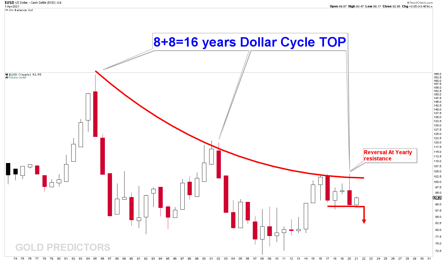
The chart below illustrates the yearly US Dollar chart. Which means that each candle represents a year. US Dollar prices have been falling from a declining curve on 8+8=16 year cycles. Every 16 years, the US Dollar hits a peak and then begins to decline for the next 8 years. The year 2020 was a perfect hit on the declining curve. The 2020 candle was a strong reversal candle, implying that the US dollar had better crash soon. The crash scenario is US dollar would push gold to higher prices.
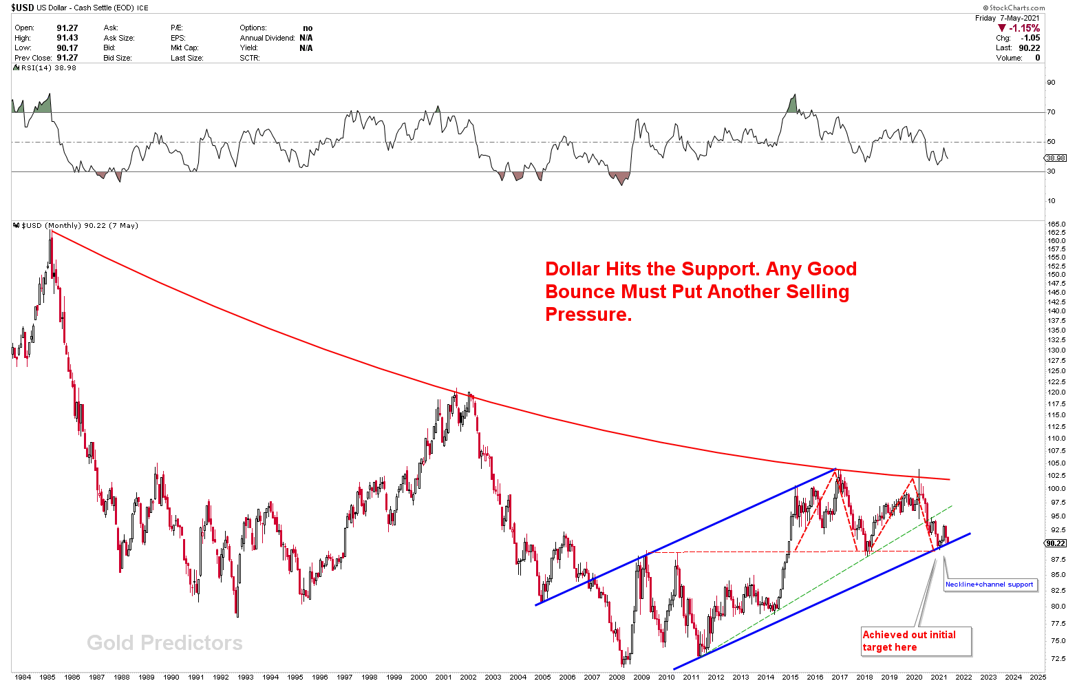
To better understand the crashing scenario, let’s look at the monthly US Dollar chart. Since 2011, the US dollar has been trading in a long-term blue channel. The dollar’s yearly reversal from arc resistance resulted in a M top scenario. The red dotted line marks the M top neckline. This red dotted line, when combined with the channel support and horizontal support, creates a powerful magnet, and a break of this support would send the US Dollar to the grounds. The US Dollar bounced from the first test of the support, but the support is now being breached.
Gold Yearly CUP & Handle
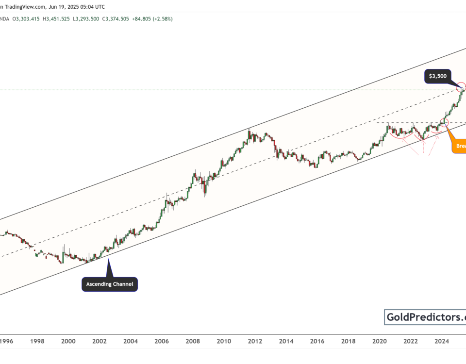
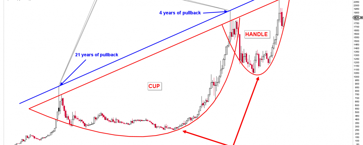
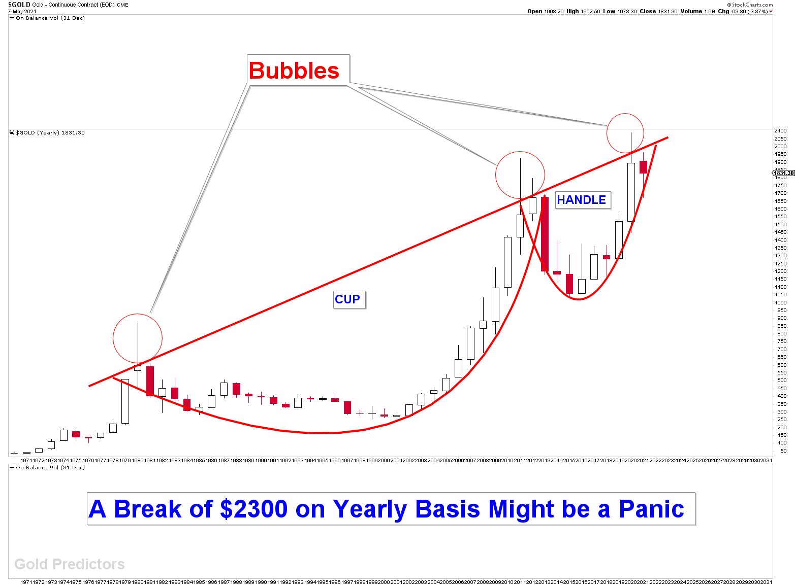
The chart below depicts the gold yearly chart. The chart speaks itself to present the extremely bullish scene. On yearly charts, a growing CUP and HANDLE indicate strong bullish case. The red neckline of the CUP and HANDLE is the ideal hurdle to challenge. The next section dives deep into a zoomed-out view of this neckline. A weekly close above this neckline would trigger a growing CUP and HANDLE breakout and a much higher price targets. This neckline spans 40 years, from 1980 to 2021, and a breakout would be referred to as a HISTORICAL BREAKOUT, causing panic in other commodity markets. The 2011 cycle top was a bubble above the neckline. And this bubble was followed by a four-year pullback in gold markets. Each time the price enters the neckline, it conclusively generates a bubble. Gold is going to enter this neckline again in 2021.
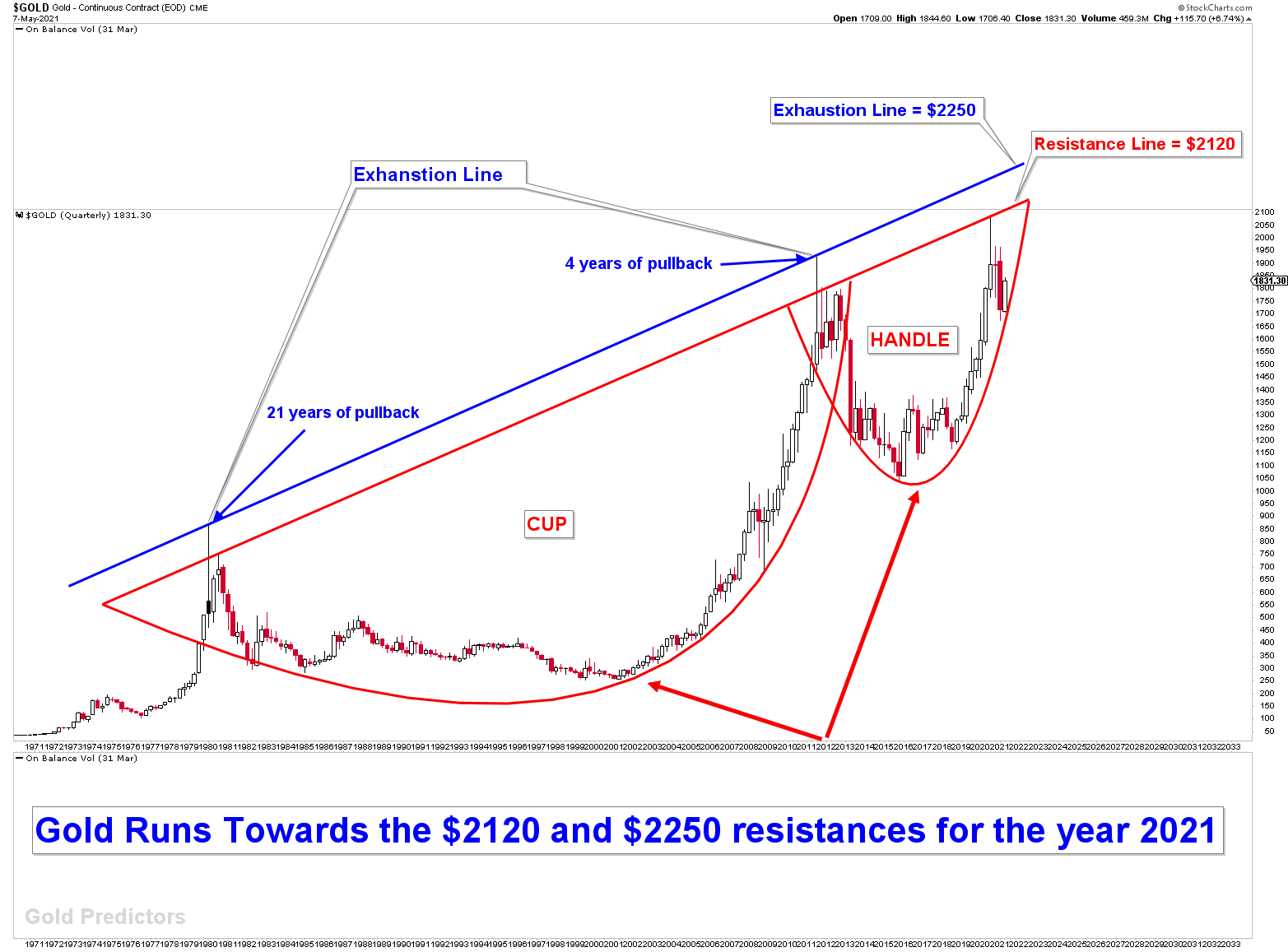
The zoom out view of the yearly gold chart is clearly visible using quarterly charts. The spikes above the read neckline are well captured by the exhaustion line in the chart below. In the year 2021, the red line approaches $2120, while the exhaustion line hits $2250. The growing CUP and HANDLE formations can only be confirmed by a yearly close above $2300. And growing CUP and handle patterns are extremely bullish case for gold, only if they are broken.
What We Expected in November 2020?
The above illustration on the yearly gold charts was well understood, which is why a bottom in the diverged cycle of March 2021 was forecasted. Premium members received the measured diverged cycle date of March 10th 2021, and the calculated yearly inflection of 1675-1680. The weekly chart (November 2020) below shows gold hitting the Ascending broadening patterns (lower line) and developing a buying opportunity.
Our Words From Last Year
Technically, Ascending Broadening patterns are bearish chart patterns with an 80% probability, but we expect a move higher from the ascending broadening wedge to higher levels on quarterly and yearly charts to fight the neckline of growing CUP & HANLE Gold Predictors
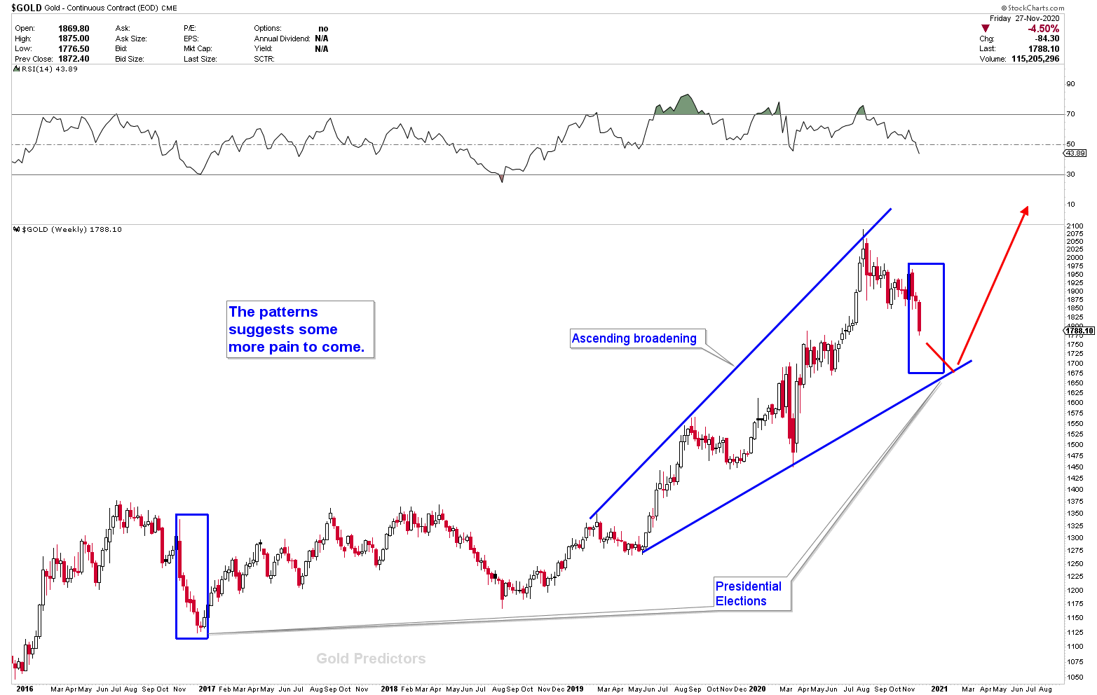
Measured Diverged Cycle of 10th March 2021 on Yearly Inflection of 1680-75
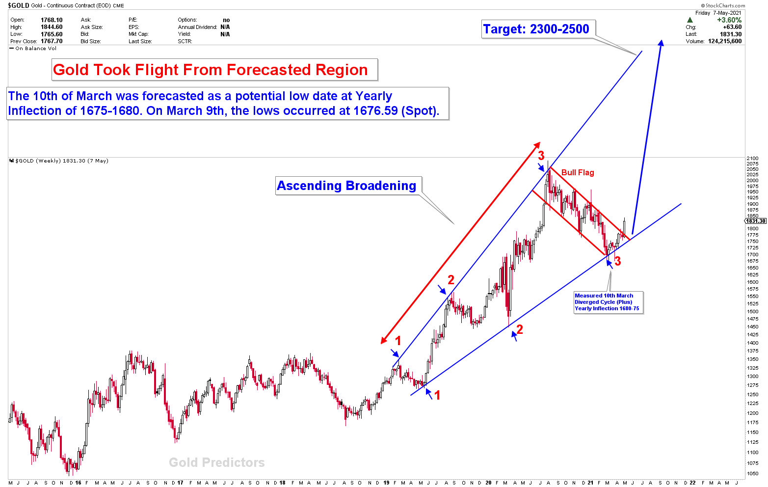
The gold price reacted to our forecast, and the cycle low was formed on 9th March 2021 at 1676 on our defined diverged cycle. The bottom was generated using a traditional double bottom on daily and weekly charts to confirm the bullish case. With weekly breakouts of 1765 and 1792, the odds of higher prices are improving, but with some wild swings. The weekly chart’s mega flag breakout is also significant. At 2300-2500, the chart below overlaps the wedge line of Ascending broadening patterns, with the yearly chart magnets of 2120 (deviations) and 2250 (deviations).
Moving Averages Kiss
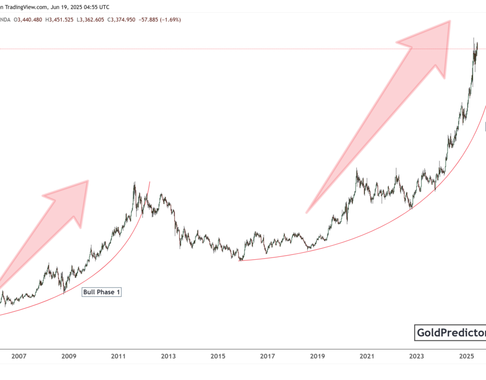
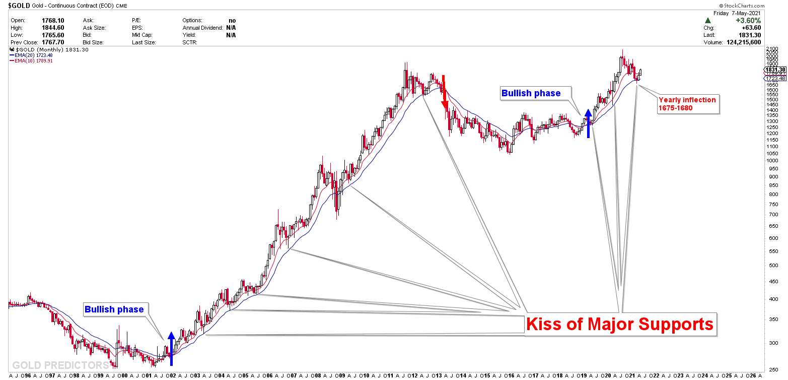
The chart below shows the 10 and 20 month moving averages, as well as how gold produces a bottom on these moving averages each time. There were six kisses on the 20-month moving average during the last bull phase of 2000-2011, resulting in six buying opportunities on the long-term charts. (Note: The 2008 pullback was not the start of a new bull phase.) The moving average was kissed for the third time during the most recent bull phase. The recent bull phase began in 2019 after an 8-year cycle bottom in 2016, and this test was exactly on the yearly inflection of 1675-1680, providing an excellent buying opportunity. However, because there are numerous overhead resistances ranging from 2000 to 2300, a serious breakout above 2300 could cause panic.
We don’t like trading moving averages, but they’re important to keep an eye on.
Will Gold Break $2300?
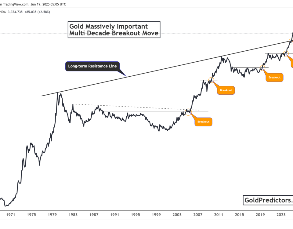
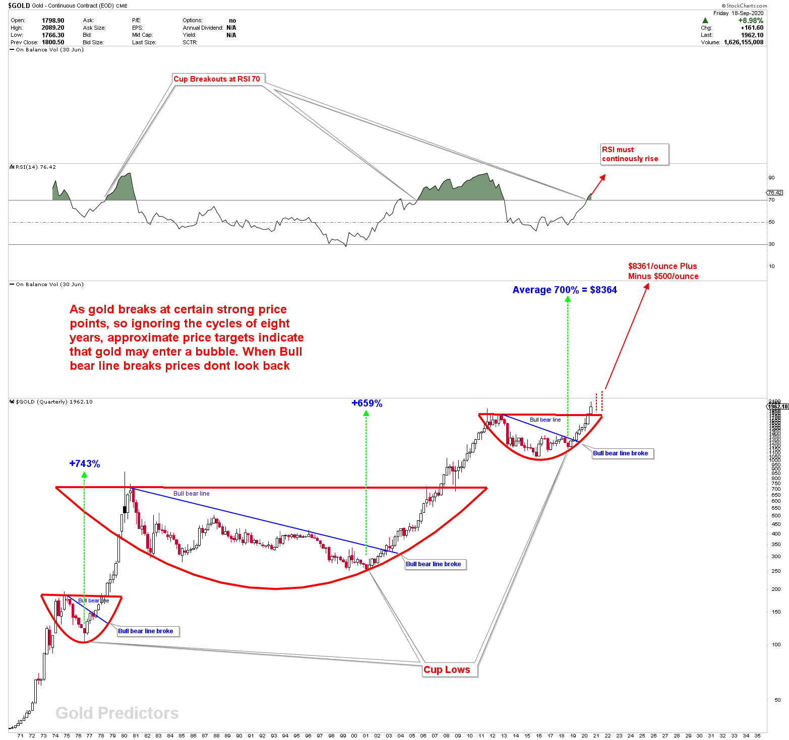
The situation is depicted in a quarterly log chart. Gold breaks all-time new highs and closes the 3rd quarter of 2020 at breakout levels, as shown in the chart below. However, if rising CUP and Handle patterns are considered, the breakout was at the initial level, and the 40 year breakout patterns still remain at $2120 (with deviations) and $2300 (with deviations).
The chart is only useful for identifying similarities between previous long-term breakouts. When the price reached a new all-time high in 1978 and 2007, a similar reaction took place. Gold gained around 743 percent of its value in the 1970s breakout, while it gained around 659 percent in the 2000 breakout (Calculated from the long term cycle bottoms). If the average 700 percent gains are calculated from the long term cycles bottom, gold can easily reach $8000 per ounce (If broken). While looking at each breakout, the CUPs break once the price is overbought, demonstrating the great similarity in patterns. RSI is overbought on quarterly charts in 2021.
Note: This scenario will only be applicable once gold closes above $2300 in 2021 and 2022.
Since newly emerging cryptocurrencies influenced the gold market in 2020, and that is a different discussion. Just to point out that gold has its own value that no other investment vehicle can take away.
Alternative Scenario: If Gold Doesn’t Break $2300
On long-term charts, the significance of the price levels can be observed. As a result, there’s a chance that gold won’t break higher and will continue to trade sideways for a longer time. Prices will fall back to major supports if Gold does not break the 2100 and 2300 regions on a yearly basis. The pivots would be different and calculated using chart mining and deep calculations based on the time of the pullback. In any type of scenario, the long -term resistances mentioned in this report are huge. We’d update if something changed because this type of scenario takes time to develop.
Few Gold Correlated Markets
Many investment vehicles and other commodities have a correlation with gold. These correlations are just a few things to keep in mind when putting together your analysis. Trading these correlations is not a good idea. It is observed that the US Dollar is inversely proportional to gold, but gold and the US Dollar can both rise together. The Japanese yen and the Euro have their own correlations with gold.
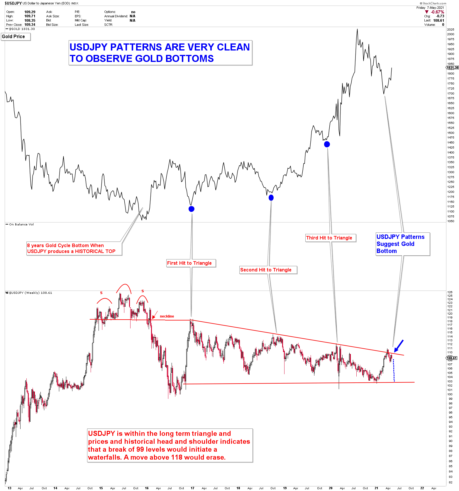
When gold prices were about to hit the yearly inflection of 1675-1680, we presented one chart to observe the Gold correlation with USDJPY. At the same time, the USDJPY was set to hit an overhead inflection. Which indicates that gold will also turn at these times and prices. The chart is shown below. With gold reaching a yearly inflection of 1680-1675, it was the fourth hit to the triangle in USDJPY.
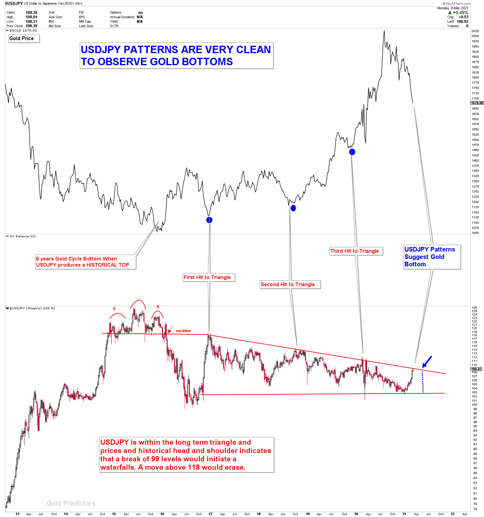
The chart also worked, and gold bottomed out, causing the USDJPY to retreat from resistance.
Note: the correlation was shown and used to forecast the Gold Market, not the USDJPY Market.
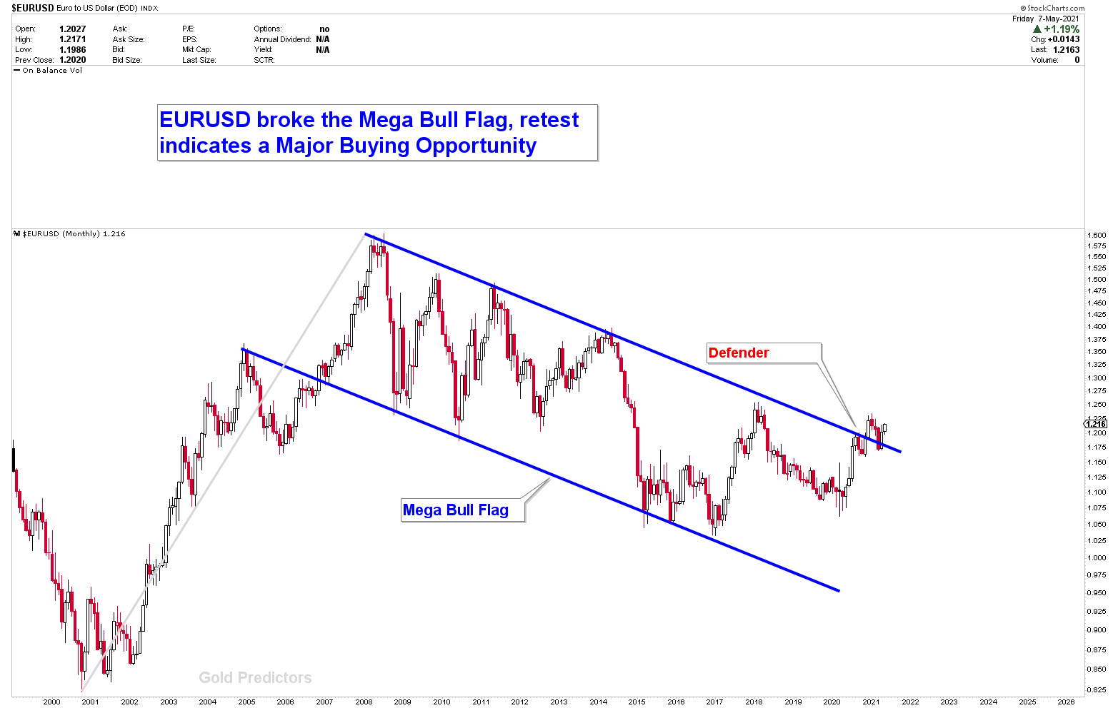
EURUSD, which is inversely proportional to the US dollar, is another correlated market. The EURUSD has retested the MEGA bull Flag. It is now exploding higher as the US dollar crashes through major long-term inflection points. When the EURUSD was testing the Flag breakout and the USDJPY was testing the triangle, this chart was also presented to members for the first time. The strengthening of the euro may put additional pressure on the US dollar, resulting in gold market exhaustion.
The Key Gold Drivers in 2021
- Uncertainty and Economic Fallout Due to Covid-19
- Loss of value of US Dollar
- Hyperinflation Risks
- Gold Investment demands
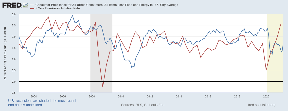
Higher inflation increases interest rates, which has an impact on bond and equity prices, as well as commodities and metals prices. The chart below shows the 5-year inflation rate and CPI breakdown. With the Biden administration’s increasingly radical policies, hyperinflation is becoming a real possibility (growing threat). The risk of a complete loss of faith in the US dollar as a store of value is increasing, potentially driving gold demand to new heights. Because of more money printing, real interest rates are likely to fall further, which is a positive factor for commodities as a store of value. In the long run, a massive increase in money supply, combined with stimulus payments, would fuel increased demand, and a supply shortage could drive gold and silver prices higher.
According to World Gold Council data, gold investment demand is once again stabilizing. In the first quarter of 2021, there was a significant increase in gold investment demand, particularly for physical gold.
Final Thoughts
Our forecast about gold prices bottom on the diverged cycle of March 10th, 2021, at Yearly Inflection of 1680-1675 came true, with prices bottoming at 1676 on March 9th. Gold is exploding higher, exhibiting some volatile behavior, and appears to be on track to reach the new levels mentioned in this article. On yearly charts, the big barriers in Gold appears to be in between $2000-$2300. With only a yearly close above this region would explode prices with confirmations of growing CUP and HANDLE formations. While a further pullback from $2300 region could bring in some more buyers.
The exact figures are $2120 and $2250, but since these are yearly data points, a $50 deviation on both sides cannot be ignored. The fundamentals favor gold in 2021. Economic turmoil and uncertainty are gold-friendly environments. The Inflection Point for New All-Time Highs is between 1900 and 1950. In the coming weeks, we’ll calculate the Exact Inflection Number for the explosion scenario.
Note To Premium Members: Long Term Trades are on hold and there is no change of stop loss and orders.
To Read Free Stuff, Please Register as a Free Member.


